Product direction
What belongs in your first MVP?
A practical way to separate the essential first release from everything that can wait.
Read the note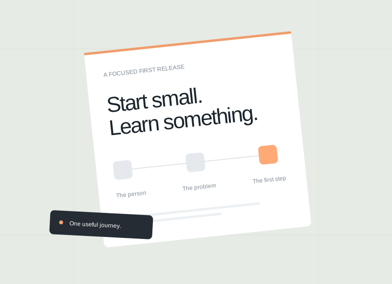

Practical notes on websites, product planning, design, and development. Find an answer to the question in front of you.
A practical way to separate the essential first release from everything that can wait.
Read the noteChoose a topic or browse all the articles.
Plan a first release and decide what to build next.
A practical way to separate the essential first release from everything that can wait.
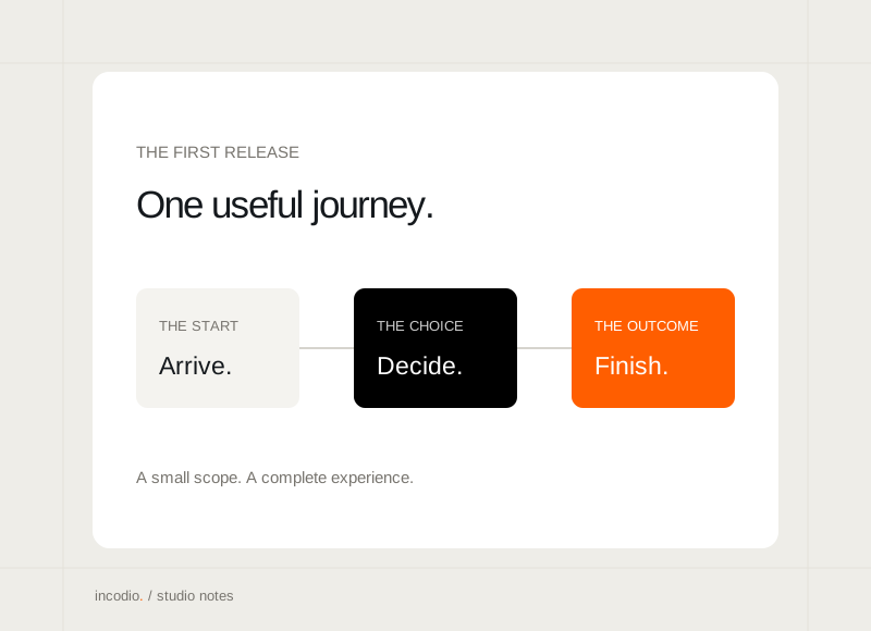
Give the first release a clear beginning, a useful outcome, and a sensible finish.
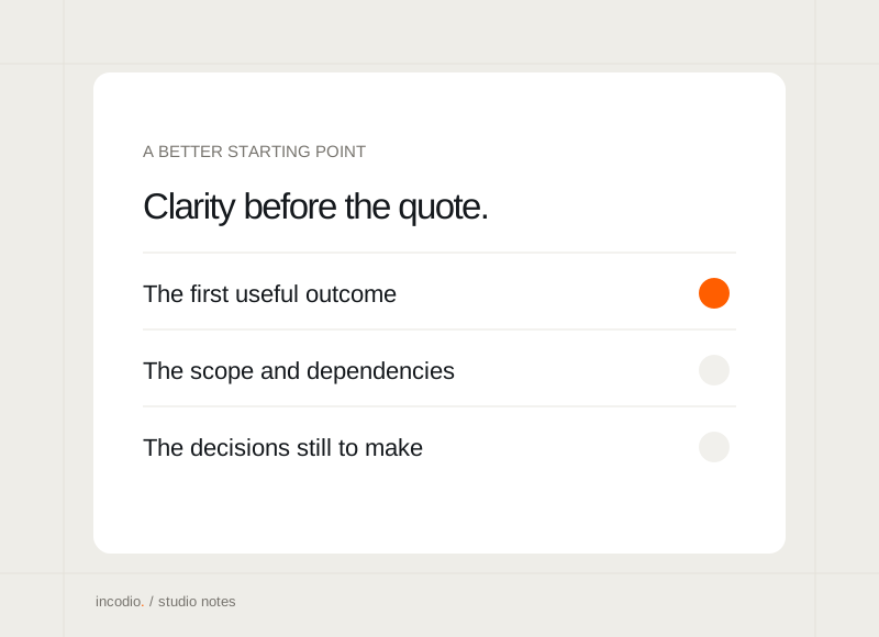
The details that make an early project conversation more useful, even without a finished brief.
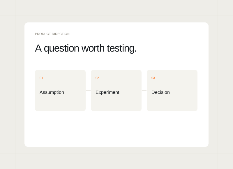
Choose a small experiment around the assumption that matters most.
Look for useful decisions and tangible outputs before committing to a build.
Use early hands-on work to understand what is worth automating.
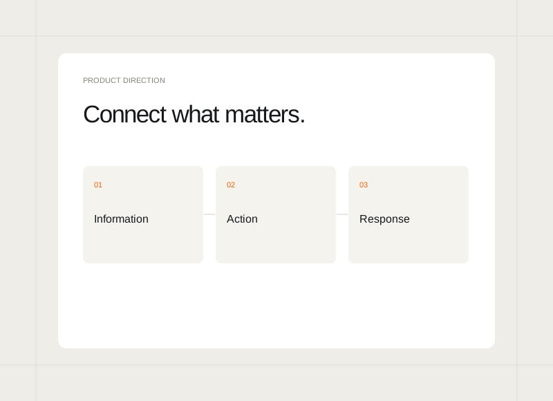
Connect systems where it makes the core journey more complete.
Turn early observations into a manageable next release.
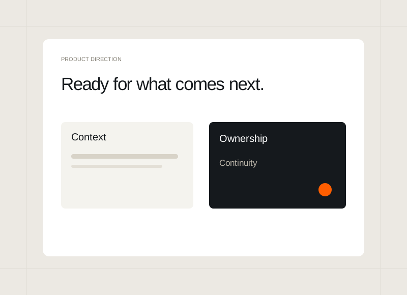
Leave the next team with context, access responsibilities, and a clear release picture.
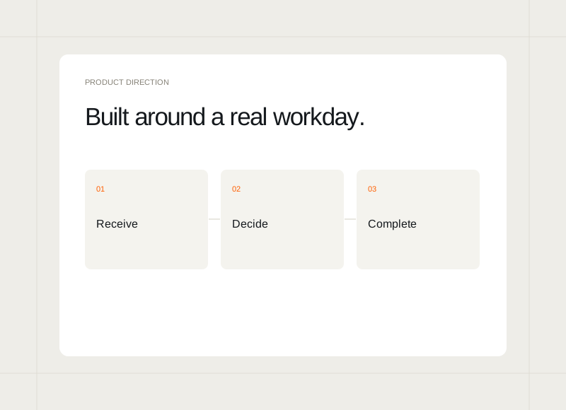
Start with the decisions, handovers, and repeated tasks a team already faces.

Write and format your content here. The page template controls the layout. Changes stay private until published.Write and format your content here.
Connect user journeys, interface behaviour, and implementation.
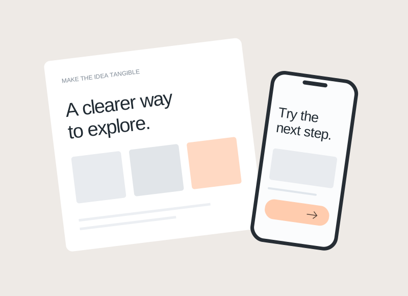
Choose the next step around what you need to learn, rather than how finished the idea looks.
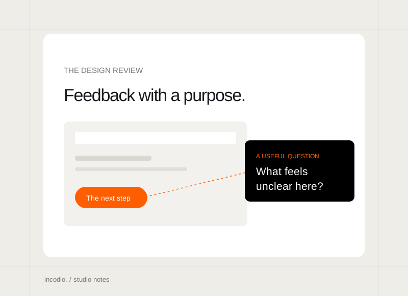
A shared goal, a real task, and specific observations make a review easier to act on.
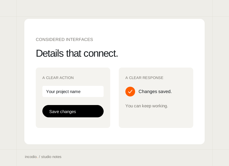
The small connections between language, layout, and behaviour that make a product easier to use.
Give an unfinished screen enough context to become usable.
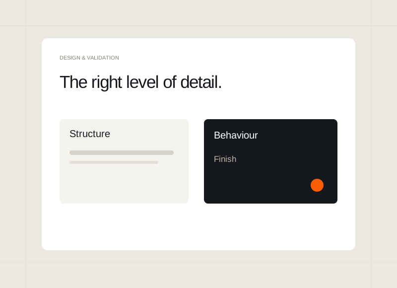
Match the finish to the decision you are trying to make.
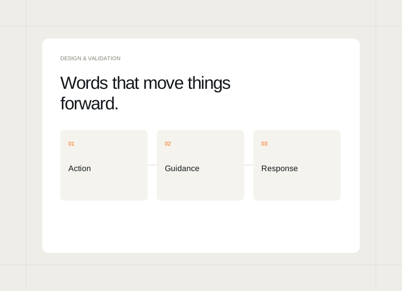
Use labels and messages to connect actions with understandable outcomes.
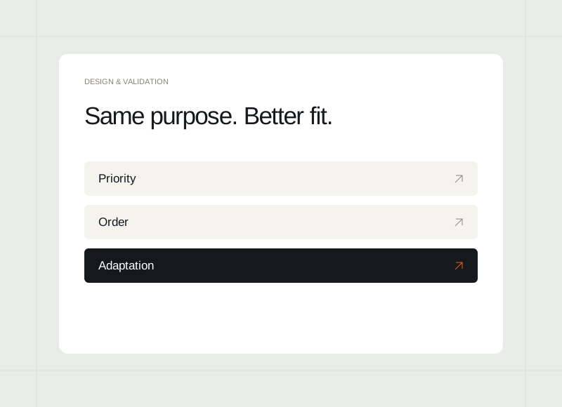
Rework the composition for the space instead of shrinking the desktop page.
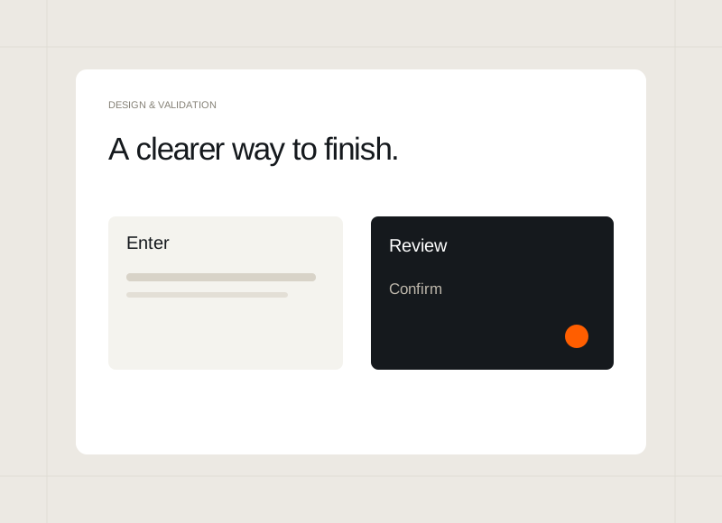
Keep the problem, the entered information, and the recovery path connected.
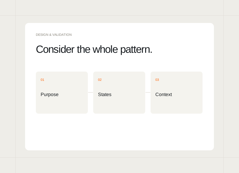
Design the variations that a real product will put under pressure.
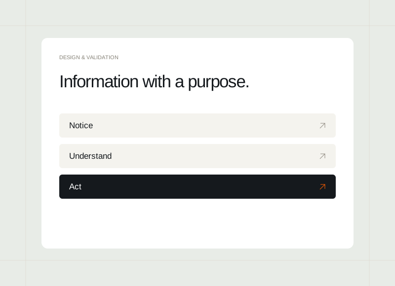
Choose the information that helps someone act, rather than filling every available panel.
Help visitors understand your offer and take action.
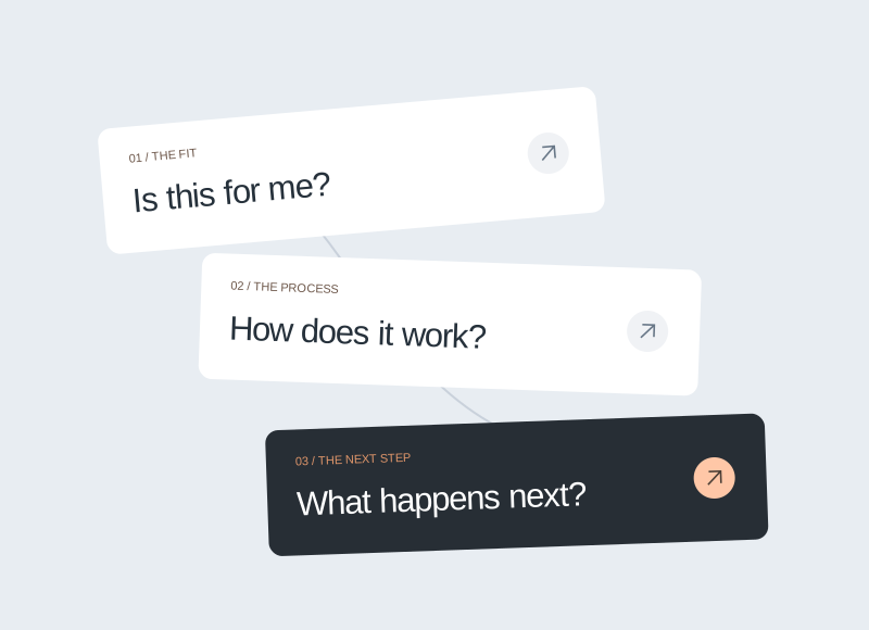
A clearer page begins with what the buyer needs to understand before taking the next step.
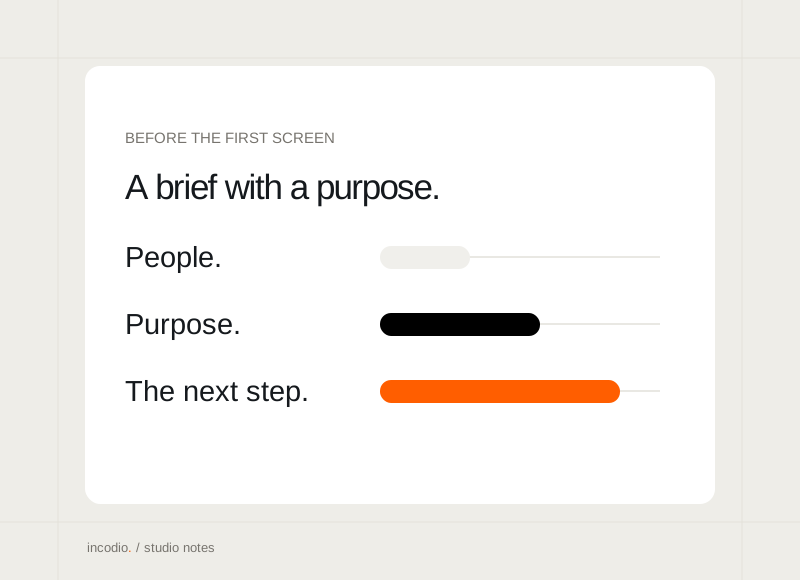
Explain the audience, the decisions the site should support, and the content you already have.
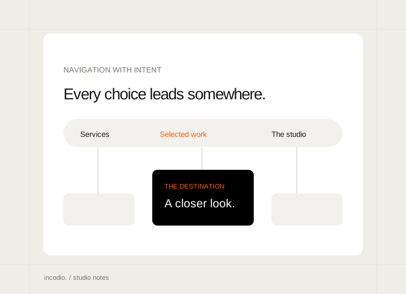
Make the choices clear, keep the labels familiar, and give each destination a distinct purpose.
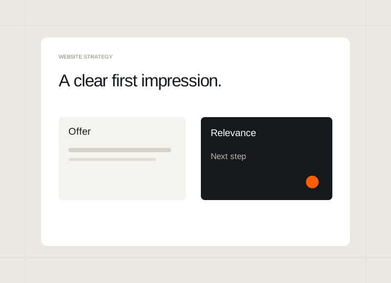
Help a new visitor understand the offer before asking them to explore.
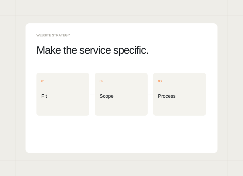
Show the fit, the work involved, and a clear way to begin.
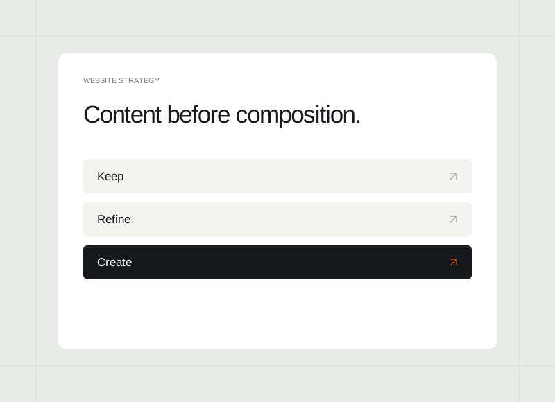
Identify what can stay, what needs work, and what is missing.
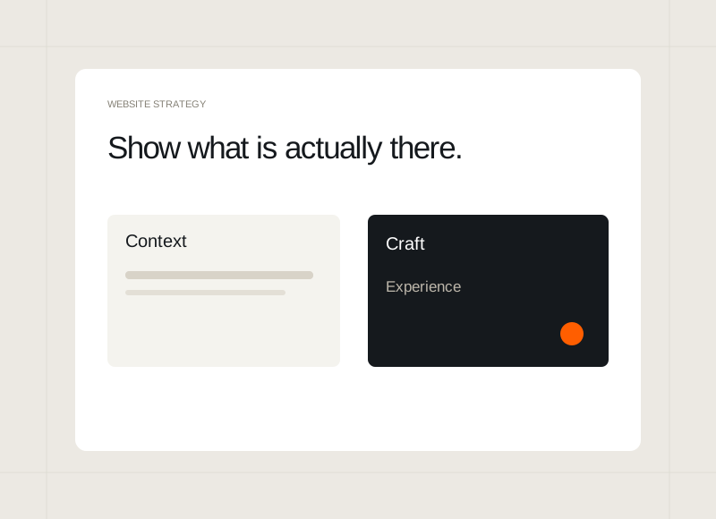
Explain design decisions and working behaviour when client outcomes are not available.
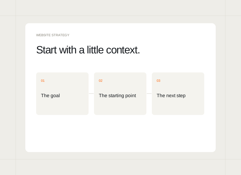
Ask for enough context to begin a useful conversation.
Check the real paths through the site, alongside the visual finish.