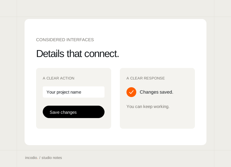
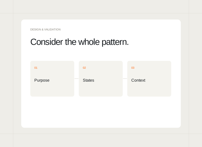
A component library becomes useful when related screens can share clear, predictable behaviour. The default visual is only a starting point. Labels, content lengths, selected states, and interaction feedback need enough definition that the next use does not require a new interpretation.
Start with a repeated job
Identify an interaction or information pattern that genuinely appears in several places. Explain what it helps someone do. Avoid turning every isolated composition into a reusable component before there is a clear relationship between its uses and the decisions they support.
Document meaningful variations
Show the states that affect understanding: an unavailable action, a selected option, an error, or content that spans more than one line. Include the language as well as the appearance. A useful variation explains a real situation rather than adding options that no current journey requires.
Test the component in a page
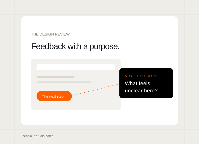
Place the pattern beside neighbouring content and within the actual task. A button can look balanced on a blank canvas but compete with several other actions in a dialog. Review the relationship between components so local consistency does not create a confusing overall hierarchy.
Keep the shared decisions findable
Record the intended use, key states, and important limitations near the component. When the product changes, update the shared pattern deliberately. This gives the next designer or developer a practical reference and reduces the chance that related screens slowly develop conflicting behaviour.