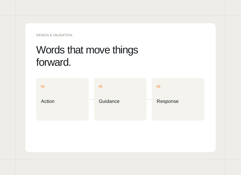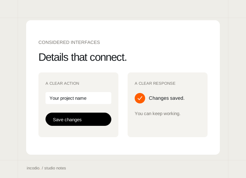
A product often looks most convincing when its lists and dashboards are full. A new user meets a different version: no projects, no activity, and little context. Designing that moment helps someone understand what belongs in the space and how to begin.
Explain why the space is empty
Distinguish a new account from a search with no matches or a failed request. Each situation needs a different response. A short explanation helps someone decide whether to add something, change a filter, or try again, without assuming the product has simply stopped working.
Show the purpose of the first action
Connect the action to a useful outcome. “Create your first project” becomes clearer when the screen also explains what that project will organise. Keep the action close to the explanation and avoid presenting several equally prominent choices before someone understands the basic task.
Use examples carefully
A sample can help explain the shape of future content. Label it clearly and avoid mixing it with real account information. The example should make the first task easier to understand, rather than filling the screen so completely that the person cannot tell what they actually own.
Check the transition into real content
Review what happens after the first item is created. The screen should retain a clear hierarchy as the list grows. Empty-state guidance can disappear, but the next ordinary action still needs to be easy to find. Test both moments as one connected experience.