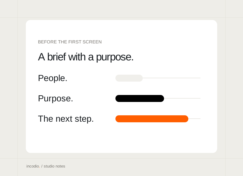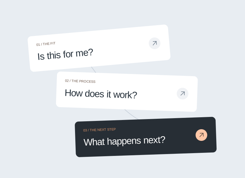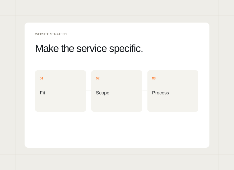
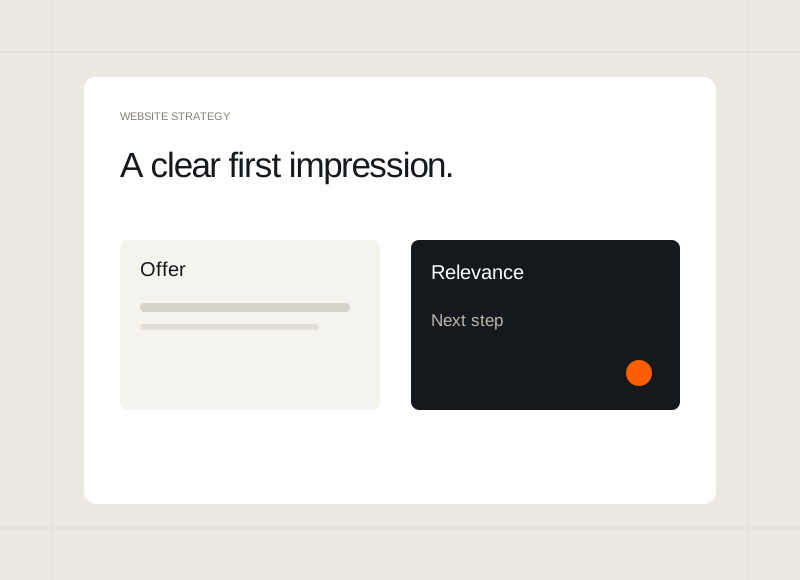
A homepage often meets someone who has little context about the business. The first screen should help that person recognise what is offered and whether it relates to their needs. A distinctive visual direction works best when the message is equally clear.
Say what the business helps with
Write the offer in language a prospective buyer can understand. A memorable phrase can carry the tone, but it should have enough supporting context to explain the actual service or product. Read the first screen without the rest of the site and note what remains unclear.
Give the visitor a point of recognition
Describe the situation or outcome the offer relates to. A new founder, an established business, and an internal product team may arrive with different questions. Choose the most important starting point rather than trying to make one sentence list every possible capability.
Use imagery to support the message
Choose an image, product preview, or illustration that adds information. It might show the quality of the work or make an unfamiliar offer more tangible. Avoid depending on decorative imagery to explain something that the heading and supporting sentence have left ambiguous.
Offer a sensible next step
Give the visitor an action that matches their level of understanding. Someone ready to discuss a project may want a direct conversation; someone still assessing the studio may need to see the work. Keep the choices distinct and ensure the destinations fulfil the expectations created by their labels.